
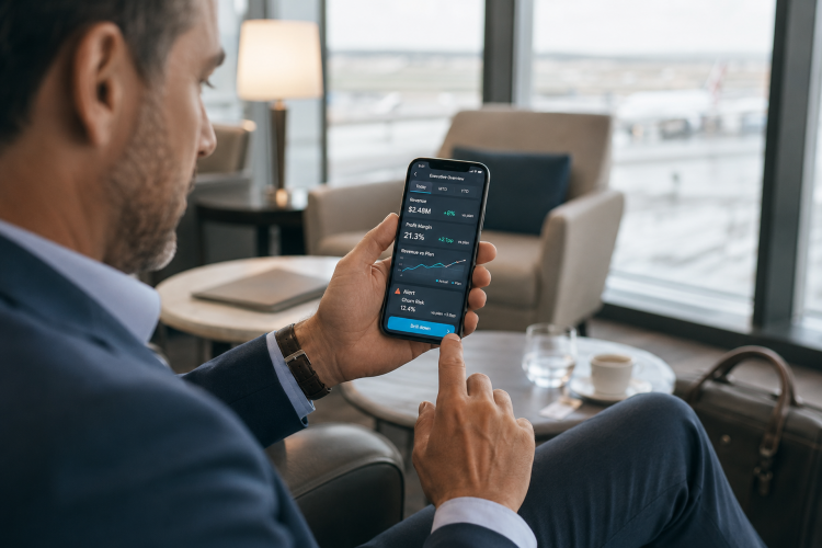
Mobile BI: What Leaders Should See When They Are Away from the Desk
Mobile BI is not a desktop dashboard squeezed onto a phone.
That may sound obvious, but many mobile analytics projects fail for exactly this reason. A company builds a useful dashboard for a large screen, then tries to shrink it. The result is a cramped collection of tiny charts, filters, and labels. Technically, the dashboard is available on mobile. Practically, no one wants to use it.
Mobile business intelligence needs a different mindset. It should help leaders and managers stay informed when they are away from their desk, without asking them to perform deep analysis on a small screen.
The question is not "Can we show everything?" The question is "What does someone need to know right now?"
Mobile Is for Signals
People usually open mobile dashboards in short moments: between meetings, during travel, before a client call, on a site visit, or while checking whether the day is going according to plan.
That context matters. A mobile view should focus on signals, not full investigation.
Good mobile BI answers questions like:
- Is anything off track?
- Which metric needs attention today?
- Has a key number crossed a threshold?
- Which customer, region, or team should I check first?
- Do I need to call someone now or can it wait?
This does not mean mobile analytics should be shallow. It means the first screen should be disciplined. The deeper analysis can still exist, but it should be one tap away, not forced into the opening view.
Choose Five Metrics, Not Fifty
A useful executive mobile dashboard often needs fewer metrics than people expect.
Five well-chosen indicators can be enough for a first view:
- revenue or pipeline status;
- customer activity or retention signal;
- operational capacity;
- support or service pressure;
- cash, margin, or risk indicator.
The exact set depends on the business. What matters is that the metrics are actionable and familiar. If a leader needs to think for ten seconds about what a metric means, it probably does not belong on the first mobile screen.
Mobile BI rewards focus. A small screen makes weak priorities obvious.
Make Alerts Specific
Mobile dashboards become more useful when they are connected to intelligent alerts.
But alerts need to be specific. "Sales changed" is not helpful. "Enterprise pipeline dropped below target in the EMEA region" is better. "Three strategic accounts have no next step logged this week" is better still.
The alert should include enough context for the user to decide whether action is needed:
- what changed;
- how serious it is;
- who owns it;
- when it was last updated;
- where to tap for details.
A good alert is not noise. It is a shortcut to the right conversation.
Design for Thumbs and Glances
Mobile BI design has to respect physical reality.
People use phones with one hand. They read quickly. They may be in bright light, a taxi, an airport, or a warehouse. Small labels, complex legends, and crowded charts do not survive those conditions.
Use large numbers, short labels, clear status colors, and simple chart types. Line charts, KPI cards, compact bars, and ranked lists often work better than complex visuals. Filters should be minimal. Tap targets should be generous.
If the user has to pinch, zoom, or rotate the phone, the design is already asking too much.
Connect Mobile to the Full Analytics Workflow
Mobile BI should not live separately from the rest of the analytics environment.
A leader may spot a signal on mobile, then ask a manager to investigate on desktop. A field manager may check a regional KPI on the phone, then open the full dashboard later. A sales lead may see an alert about stalled accounts and assign follow-ups in the CRM.
The mobile view should connect to the same trusted data, definitions, permissions, and refresh logic as desktop reporting. Otherwise, mobile becomes another channel for conflicting numbers.
Consistency matters more than novelty. If the mobile number does not match the board report, trust disappears quickly.
Where Mobile BI Works Best
Mobile analytics is especially valuable for people who move through the day:
- executives who need a quick business pulse;
- sales leaders checking pipeline before calls;
- operations managers visiting locations;
- field teams tracking service performance;
- customer success managers monitoring account risk;
- finance leaders watching cash or margin signals.
In each case, mobile BI should reduce delay. It should help people notice the important thing sooner.
Final Thought
The best mobile dashboards feel almost calm. They do not try to impress with density. They show the few signals that matter, explain what changed, and make the next step easy.
If you are building a mobile analytics view, start by removing. Remove metrics that do not trigger action. Remove charts that need a large screen. Remove filters that only analysts use. Then keep the essentials: status, change, owner, and next step.
Mobile BI is not smaller BI. It is faster clarity.